Awe.
That was the biggest word on the tip of my tongue walking out of Memorial High School after getting the chance to tour the campus earlier this week.
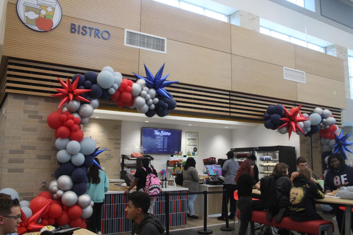
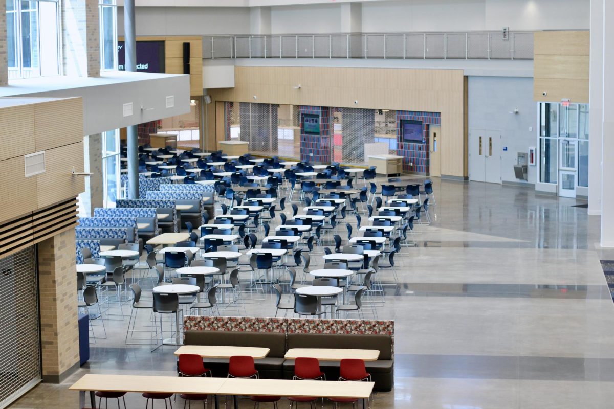
The first thing that caught my eye was how open the entire building is. Whether you’re coming into the grandiose entrance or you’re near the large stairs and broad hallways, everything feels very spacious. It’s as if the school is designed to give extra room to breathe.
The campus also has an increased emphasis on storage.
While visiting Chris Preston’s science classroom, he took note to point out both the storage closet and large amounts of cabinets spread across the room. The band area as well had several closets to store uniforms and a large room for instrument storage.
The thing I appreciate the most is the increased love to the different fine arts. Coming from Rider, the fine arts classes certainly weren’t ignored, but Memorial’s fine arts areas are expansive.
The art classes had access to a balcony which they could use for outside projects. The theater had a black-box room for productions and practices, and the orchestra had its own room outside of the band hall.
All these decisions felt like they were making clear that the school is focused on providing extracurriculars that can enrich students’ artistic and imaginative side.
There were two things that seemed a tad unorthodox. First, the library isn’t in its own room, but instead set aside as part of the bigger opening area.
While I do appreciate the attempt to make the library more accessible, not letting it have its own designated room felt like an odd stylistic choice. It lacked the authenticity of a library, feeling more manufactured and industrial.
Which overall boils down to my biggest critique of the school, although it is one of personal taste. Despite all the impressive feats that the campus accomplishes and the wonder modern architecture is able to bring, it lacks an authenticity and charm of older architecture.
It overall feels a little stale, cookie cutter, like there are a dozen other modern high schools with identical features and architectural style. Modern architecture lacks the undeniable charm of older buildings, such as the previous high schools.
But ultimately that boils down to a small nitpick. The school is overall incredibly impressive, the spacious rooms, halls and new additions scream the building was crafted with the love of learning and teaching in mind.


Caroline Lee • Aug 3, 2024 at 10:51 pm
Well written Beckham! You always have thoughtful opinions.